
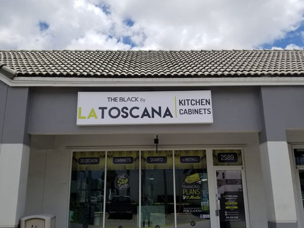
There are two primary goals with custom storefront signs: elevating the appearance of a commercial property and delivering an impactful message to customers.
How can businesses balance these seemingly contradictory goals? It might seem complicated, but with the help of a professional sign maker and the guiding principles of design, it is possible to achieve these objectives.
Let’s examine some of the critical elements that contribute to a sign’s aesthetics and functionality.
Branding Storefront Signs for Businesses
Signs are like the face of a business. They are the first thing people see when they pass a location, which means it is essential that companies include their branding in their sign’s design. Elements such as your
business’s logo, wordmark, and tagline can make a lasting impact on people and assist with brand recall later.
Work with a professional sign company to ensure these design features are incorporated into any exterior signage.
Determine the Messaging of Retail Storefront Signs
Business owners have mere seconds to make an impression on passing customer traffic. That’s why having a message that is easy to understand and memorable is important.
For most storefront signs, core messaging should include:
· Your business’s name
· Contact information
· The products and services available
A professional sign designer can work with you to determine the most effective layout and phrasing for your sign. Remember, less is more; it is better to have a sign that delivers one clear message than overwhelming people with too much information. Businesses can always invest in window graphics or banners to provide supplementary information.
Implementing Typography in Window Storefront Signs
Typography refers to the style and layout of printed text. Its principles are crucial when designing commercial signage to enhance readability and reach a larger target market.
For storefront signs, it is recommended to select a sans-serif font to improve legibility. Be sure all text is large enough to read from a distance and that there is proper spacing between letters and words. Together, these factors will create a sign which is both a powerful communication tool and a pleasing aesthetic addition to the community.
Color Theory and Contrast in Custom Storefront Signs
Including a brand’s colors in storefront signage is advised to maintain consistency and present a cohesive brand image.
Besides a company’s custom colors, business owners and sign makers need to be mindful of a sign’s contrast, particularly between the background and text. Having a high contrast between these areas, such as a light background with dark text, will allow everyone to see the sign’s message clearly. Selecting the proper colors and contrast when designing a sign plays a critical role in its functionality.
Contact Us for Business Storefront Signs and Graphics
Are you ready to elevate your storefront signs with visually appealing layouts and impactful messaging? Then, don’t hesitate to reach out to the experts at Major League Signs today.
With us by your side, we’ll ensure your project is captivating, engaging, and creative. We specialize in custom solutions tailored to a business’s needs. Plus, our full-service company designs, manufactures, and installs premium signage, giving busy business owners the freedom to tend to their enterprises while we handle their projects.
Give us a call to book a consultation with our team today.