‘Fail to prepare, prepare to fail.’ Nowhere is that adage truer than in banner design. Designing banners that will attract attention requires planning and preparation. In fact, there is no right banner design that will work in all situations.
Before you start to think of ‘what is an eye-catching design’, ask this instead:
- Where will the banners be displayed?
- How big will the banners be?
- What kind of message do you need to convey?
An attractive and effective banner must be fit for purpose. And on the basis of these questions you can start to find the right banner design.
Banners need to be customized: the same design will not be effective in every situation.
5 tips for attractive Miami banners and signs
There are a few basic design principles that need to be followed to create effective banners in Miami, Florida. These are related to:
- Size and shape
- Hierarchy of elements
- Message and font
- Graphics
- Colors
1. Size and shape
Bigger is better but a banner that is too large for your installation is no good. Size and shape are essential because they define your canvas. Take into account how far your audience will be from the banner and if there are any restrictions on the size of the banner. Banner shape is another excellent opportunity to make it stand out. Lamp post banners, for instance, are curved along one edge which gives them a more seamless appearance and maximizes advertising room.
2. Hierarchy of elements
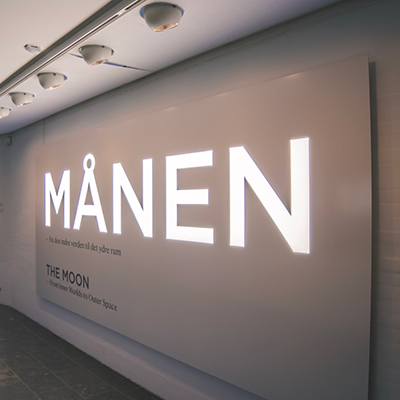
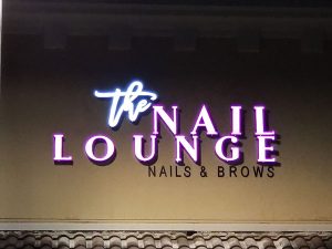
Hierarchy clarifies layout and prioritizes the different elements of the sign. It helps identify what must be conveyed to the audience and how it must be presented. Typically, brand and logos are the most important visual elements of the banner, while the specific promotion is the dominant text. Elements at different levels of hierarchy differ in size, visual impact and location on the banner.
3. Message and font
Information needs to be separated into primary and secondary information. This way, the most important messaging can be displayed as headings while additional information can be incorporated as sub-headings, bullet points or even word clouds. Of course, how much text should be included depends on the size of the banner and how far it will be from the audience. Choosing the font is essential, too, for making effective banners. We usually recommend avoiding cursive fonts because they affect legibility. Choosing fonts that match the aesthetic of the banner makes it look neater too.
Custom banners in Miami are a simple and affordable way of promoting your brand, business or event.
4. Graphics
Images, graphics and colors must work together to effectively convey the meaning of Miami banners and signs. Bold images of the product/service make obvious what is being promoted; graphics can be used to enhance that message; and colors correlate the banner with your branding. However, avoid graphical clutter as it can change focus.
5. Colors
We mentioned colors briefly as a branding tool but they play a much more important role than that. Colors are closely associated with emotion, attributes and energy. For instance, green is associated with acceptance; red with anger; and blue with surprise. Colors also reflect trends – such as green being used to denote nature and eco-friendliness. Use colors to provide subtle cues as to what your banner is about.
Miami banners and signs
Major League Signs works with organizations to create intelligently designed banners in Miami, Florida. Our team works closely with customers to realize exactly the signs and banners they want. We have the capacity to take on large orders for banners in Miami and accept last minute orders too. Speak to a representative about your requirement.